BLOG

Keep up with the latest art and adventures from Rene Shoemaker Art!

Spirit of the Land

I recently created two new intimate paintings on silk I wanted to share with you. They are for the invitational art exhibit: “Spirit of the Land: Small Scale Images of the Georgia Landscape” opening tonight(!) at the State Botanical Gardens at the University of Georgia, Athens, Ga.

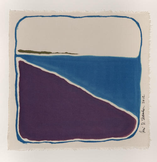
                             Tybee Island, Chatham County, Ga. 2012. 10”x10” (Sold!)

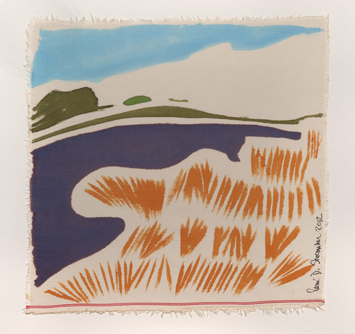
                         Kennedy Road Beaver Pond, Oconee County, Ga. 2012. 10”x10”

The Tybee Island piece is a quiet design using only three colors to express the quietness of walking alone on the beach, taking in the the smell of the ocean and feeling the warmth of the sun on my face.

The Kennedy Road Beaver Pond is within walking distance of my house, and we marvel at the beauty of the grasses, the pond, the fields and the hills. I’ve loosened up my style with this painting, encouraged by the curator’s instruction to describe the natural wonders of our state.  

Here is more information from the publicity for the event:

The Athens Land Trust and the Oconee River Land Trust are proud to present the 2012 Spirit of the Land Art Exhibit and Sale! The opening reception for this year’s art exhibit and sale will be held Tuesday, August 7th, beginning at 5:30 pm at the State Botanical Garden Visitors Center Gallery. Dr. Paul A. Manoguerra, Chief Curator and Curator of American Art at the C.L. Morehead Jr. Center for the Study of American Art at the Georgia Museum of Art, will provide perspective and insight in a gallery talk beginning at 7:00 pm; refreshments will be provided.

According to exhibit curator, Dr. Manoguerra, works selected for this exhibition have found inspiration in our state’s natural wonders and landscapes. However, the works will also be presented in small formats, marked by an intensity of vision and a familiarity of the subject matter in execution. Hans Hoffman once stated, “A small picture format may be much more living, much more leavening, stirring, awakening than square yards of wall space.” The small-scale images in the display will also permit viewers to thoughtfully and intimately experience the Georgia landscape. 

Works of art by many talented artists will be on display and for sale, including art by: Margaret Agner, Matt Alston, June Ball, Elizabeth Barton, Toni Carlucci, Sally Coenen, Larry Forte, Philip Juras, Dianne Penny, Mary Porter, and René D. Shoemaker. The art exhibit and sale will run from August 5th through September 9th, 2012. The artists will receive 50% of the purchase price, and 20% each of the proceeds will go to Athens Land Trust and the Oconee River Land Trust, with the remaining 10% going to the State Botanical Garden. Purchases can be made at the State Botanical Garden Visitors Center Gallery or by calling Athens Land Trust at 706-613-0122 or Oconee River Land Trust at 706-552-3138.

The State Botanical Garden is located at 2450 S. Milledge Avenue. Click here to view the map. I won’t be attending the opening reception, as I’ve been out of town for over two weeks, but you’ll be hearing about that adventure very soon!

New art installation for UGA

Last week my new (huge!) UGA art installation went up. Meet Passages II!

The artist’s statement for this site-specific design includes information about the mobile and its concept:

The mobile was installed in honor of Dr. Jane Russell, the woman who envisioned and created the Ramsey Student Center for Physical Activities, the place we can visit to discover our personal best. We celebrate Dr. Russell’s service to the University upon her retirement, and wish her well in all her endeavors.

The charmeuse silk squares, and the square designs placed on the silks, represent movement through time and space, the journey we take in life to find our way. This art installation was conceived and created by fiber artist René D. Shoemaker.”

I love creating site-specific work. As I studied this location (at the Ramsey Student Center for Physical Activities on the University of Georgia campus), I thought very carefully about how my design would affect and be affected by its setting. As you may have read before, I love squares, so I was pleased that my work would be situated in front of a wall of square windows. The windows correspond so nicely with the colorful silk squares in my installation! As my intention was to create a feeling of movement - ascending -  through the color choice and movement of the individual pieces, the fact that it is installed next to a climbing wall also seems very appropriate. I love the idea of the climbers looking back over their shoulders and seeing this colorful mass moving behind them! 

It took two days to complete the installation. I needed to do the layout, and the measuring and cutting of the monofilament to hang the silk, on site. I set up a system of measuring without tangling the line and even used my toes as pliers when I didn’t have a second pair available! I sewed and tied and stretched and prepared each of the silks for hanging:

The installation process was a work of art in itself. I had a whole hallway to work in, and I laid the silk on the floor in the configuration in which it was going to hang. The space has 47’ high ceilings, so a Genie Boom-Lift bucket was used to hang the work from the ceiling. The boom-lift had amazing articulation, and could go anywhere it needed to - sideways,forwards, backwards, up or down. The silks were tied to 3 armatures, and each armature needed to be hung on to the ceiling separately. They were clipped onto a hook and bearing that had already been installed. 

…It was a fabulous experience, seeing the silks being lifted to the sky (or ceiling, as the case may be), and then watching how they reacted to the air currents. This may not be evident from the photos, but not only does each silk slowly spin at its own pace, but each of the three different armatures revolve independently as well! It is so pretty. The silks look out over the courtyard beyond the windows:


It was very rewarding for me, to stand there, and to watch the colors come alive as if they were dancing. I didn’t expect this, but the stretched silk softly ripples on each of the  units when the air currents change, making an even more lively display.

Many thanks to the “team” who helped make this happen, especially to Benny at the Instrument Shop for creating the metal armatures, rods, and bearings for the silks to spin on, and to Jeremy for being a professional at using the bucket lift for the installation, and for understanding the concept of the design. Thanks to Keith for seeing the project happen, and of course - many thanks to Jane Russell for the inspiration!

Here are some members of the team at the time of completion - don’t we all look happy to have it done?

All-in-all it was an amazing experience and I hope to do many more such commissions in the future! 

Coffee! - 9th Street Espresso, NYC


My favorite coffee shop in all of New York City is 9th Street Espresso - and although I love the three newer locations too, I’m talking about the original, down to earth, fun-to-be-in, coffeeshop-vibe-experience storefront at 9th Street Espresso, 700 East 9th Street between Ave C & Ave D, NYC. I love returning to the Village, I love the neighborhood, I love the street scene, and I love the community garden across the street from 9th Street Espresso…

I was so moved by my experience at 9th Street Espresso that I sketched a drawing on site, then came home and made a silk painting from it (see above). This painting was in my solo exhibit at the Shade Bar at 241 Sullivan Street (between Bleecker St and 3rd St).

You can be sure that the day of my exhibit, after eating a yummy grilled eggplant sandwich at the Shade, I walked to the East Village and had a shot of 9th Street Espresso to keep me going deep into the night!

I highly encourage anyone who values a great coffee experience to stop by 9th Street Espresso. Their no-nonsense approach to creating a great cup of espresso is very satisfying! 

Colors!

I went to a lecture recently at the Georgia Museum of Art to learn more about one of my favorite topics - color!  The UGA Fabric Design Department invited Leslie Harrington, the Executive Director of the Color Association of the United State (CAUS), to visit in celebration of an exhibit that is currently on view at the Georgia Museum: “Pattern and Palette in Print: Gentry Magazine and a New Generation of Trendsetters”.

Heading up an organization that was founded in 1915, Ms Harrington and her company “creates and delivers global color intelligence across industries”. That means they analyze popular colors over time, they predict which colors will become popular next, and they educate others about the importance of coordinating colors across industries. So, they help to ensure that all American flags are the same colors, that your neighbor’s camouflage shorts will use the same hues as his camouflage coffee mug, and that your cousin will be able to buy kitchen appliances, an apron, AND nail polish in fun retro colors. Rather than working directly with consumers, they position themselves as “trusted advisor(s) to color professionals whose responsibility is to ensure marketplace success for their color decisions in the realm of brands, product and service, and spatial environments.” Even Pantone looks to them for advice and ideas! How cool is that??

An example of what you might see:

As for the GMOA exhibition, it introduced me to Gentry magazine, which, it turns out, is one cool magazine. Gentry was published from 1951 to 1957 and its mission was to help a gentleman be, well, just that - a gentleman. It covered many topics - art, future, fashion, literature. It was extremely well put-together; heavy paper, original art and actual fabric swatches to help people really know about the colors and patterns of the items that were being advertised in the magazine!

It had many famous contributors. Even my favorite artist, Henri Matisse, had artwork on the cover of the journal in 1956-57. The GMOA writes about about the cover here.

The students of the UGA Fabric Design department (my alma mater) created their own color palettes and designs in response to articles and advertisements in Gentry magazine. The resulting textile designs were silkscreened on large swaths of paper and are on display in the Georgia Museum’s exhibition. Here are three examples of what the students created:

Nice, yes?

Back to color, though -  imagine living in a world immersed in color, like Ms. Harrington does.

Oh - you say, that is what I do? 

        You are right! I am very lucky!

Ms. Harrington gave me a few tidbits that I jotted down to think about for my own work:

Color preferences of consumers for a specific period and time.

    As an artist, I have shied away from the concept of being sensitive to other’s color preferences. But as a creator of items for interiors and fashion, I guess I should pay attention! I was aware of color forecasting, but this lecture opened my eyes to the benefit of keeping up with it, and the myriad of possibilities involved in working with or anticipating trends. I had never thought about how strongly people associate certain shades with certain emotions, events, objects, or even time periods. Do you remember the deep oranges and browns that many people associate with the 70s? Isn’t that what you immediately think of when you see, say, a dark orange couch? 

Colors come in three flavors: Fad vs trend vs classic

   Now I have a way to categorize colors as I discover them. A fad may be bright color that seems to be everywhere for a brief period of time. Neons often seem to fall into this category! A trend is a little more classy, and lasts a little longer. Shades like jewel tones are versatile and pleasing to the eye. A classic, well, it makes you feel good; it is a staple, an elegant choice; yet it can be luxurious or casual. Classics like Black, Ivory, White and Brown are always popular!

Color across industries, across markets, across specializations, across disciplines, and across experiences…. 

     Color is everywhere! Watching what color is doing in these various categories will only help me become stronger in my art of color. My mind has now been opened to the bigger world of color. It will be fun to begin exploring these categories, to keep up with what is happening in color, and to see what is influencing the world of color, fashions and interiors.

If you are interested in looking at more information about all this, there is a list of articles related to color and/or color forecasting on the CAUS website:

http://www.colorassociation.com/media

Learn more about CAUS and the ways that they empower color conscious decisions at:

http://www.colorassociation.com/

Now, you will never look at color the same way again!

                What are your favorite experiences with color?