BLOG

Keep up with the latest art and adventures from Rene Shoemaker Art!

Shopping as Museum Experience

This week, I’ve been thinking about what a fun experience shopping can be. Whether I’m browsing, picking up necessities, searching for gifts, or treating myself, I’m always looking for inspiration. Some stores are so full of good design that going in is almost like visiting a museum! I also find it interesting to see what each shop’s “look” is, whether it is an online or brick-and-mortar store - what their aesthetic is and how they communicate it through their selection of products, signage, layout, and so on. 

For example, two of my favorite stores, UniQlo http://www.uniqlo.com/us/ and Muji http://www.muji.us/store/, 
are not in my hometown (I’ve only seen them in big cities) and haven’t had much of an online presence until recently…. making it extra special to visit in person. Both focus on clean, useful designs, and their products are presented - in packaging, store displays, and layout - in a very no-frills, minimal way. This is especially true of Muji - they design everything using a Japanese unit called “sunn” which means “thumb” - so everything is designed, usefully, by the thumb unit! So cool! That way, everything they design for, say, a briefcase or a carry-on travel bag, fits together so nicely - the soap container fits in the toiletry bag, the toiletry bag fits into the suitcase, the suitcase fits on the shelf in your bedroom, etc… I always keep a couple of their catalogs on my design book shelf! Recently a book has come out on the Muji experience - I can’t wait to check it out. You can read more about it on their website: http://www.muji.us/store/muji-book.html

In my hometown of Athens, Ga., Helix is a great store to wander into and spend a bit of time in. They support local craftspeople, they have a good collection of items, and their design sense is lively. It’s fun to go in there on a regular basis to see what new items they have located and made available to us. 

But for online shopping and browsing, Etsy rules. If you don’t know about Etsy you must learn about it RIGHT NOW! It is THE place to shop … it is a 6 year old online home-made marketplace - everything you buy is directly from the maker to the consumer. You also have the option to search by location, so if you’re interested in the local foods movement, for example, you can buy LOCAL CRAFTS too! People sell very usable items such as kichenware, totes, and jewlery in addition to fun things like toys, pet supplies, or pottery. It feels great to buy right from the person who has designed and created your item, and to know that the purchase price is supporting them and their ability to make what they love. It’s a bit like the historic cottage craft system of the past…. only much more versatile!

I’ve been doing even more research lately on the Etsy community, because I’ll be opening a shop there soon. I’ll sell greeting cards and smaller textiles (tea towels, napkins, etc) and perhaps one day make my silk items available there as well. Etsy has a wonderful support network built in - they really try to educate their community to be the best business people they can be. You can check it out at http://www.etsy.com/ - DO look around at what everyone else has - it’s wonderfully exciting! It just may change your life! 

Tell me, what are your favorite online or real-life resources for fun items, interesting gifts, or beautiful designs? Do you have any favorite Etsy shops you think I should know about? I’ll collect your responses and share them in future post!

A Closer Look

The interview by WE Design Studios that I mentioned in my last post was published this week. It is titled “A Closer Look: Rene Shoemaker,” by David Elden, and can be found at:

            http://wedesignstudios.com/2011/04/a-closer-look-rene-shoemaker/

In this interview, I explain some more about how my work takes shape, what my techniques and inspirations are, and how the view from my studio window has changed in the last six months!

       Enjoy!

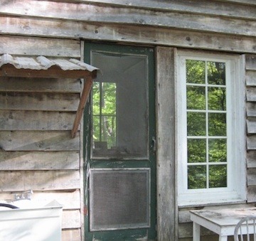
                                                 Coffee Cup Press - Studio exterior

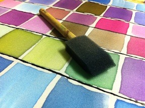
Tools of the Trade

I’m excited to announce that my friends at WE Design Studios will soon be publishing a “Coffee Cup Press” interview about my inspirations and creative process. I was finishing that up last week… be sure to keep an eye on their blog at http://wedesignstudios.com/  Sorry if you missed me - I certainly missed you! 

Having spent so much time lately on tax preparation work, it was a great feeling to put the calculator down and get back to the studio. It was nice to return to my dyes, my fabric, and my tools. One of the WE Design interview questions got me thinking about my favorite piece of equipment… 

It seems so silly - but I think that my favorite tool is actually the very humble foam brush! What can be more un-sexy than a plain grey foam brush on a plain beige wooden handle? Ah, but the colors that come off that brush after it has been dipped into a cup of dye and applied to a piece of silk! 

Though these foam brushes come in different sizes, I prefer to work with two-inch wide ones. Any smaller, and the dye is too difficult to control… And the wider brushes just don’t seem to keep contact with the silk consistently. I’ve experimented with other types of brushes, but none provide the same feeling of control that this brush does. I love the way the brush never seems to drip dyes - I can use a tiny corner to color the smallest section of silk, or create a swash of color on a large area, moving quickly and smoothly back and forth, back and forth. 

So unassuming, so matter of fact, so un-glitzy, so ready to go to work - costing about 35 cents each, these brushes last for years. From what I understand, they were created to help house painters paint trim around windows and doors; I imagine they do that job well too, but for me, I am in love with them for the way they work with the dye.

………………………………

I received several lovely responses to my recent post on the new animal alphabet… I’ve chosen a few to share here: 

-Amy, massage therapist and mother of new baby Wren, wrote “I love these alphabet animals so much I am going to explode!” (And this makes me so happy!)

-Garden curator Maureen wrote and suggested V for vole - “a vegetarian version of a mole, really!” - creating a discussion on whether a Vole or a Vixen (female fox) would be more appropriate… 

-my poet niece Liz sent a wonderful photo of a Swallow Tailed Sparrow Kite she spotted in the park, and suggested this image for the ever-elusive “X” for the animal alphabet:

Thanks to everyone for your support and responses. Keep them coming - See you next week!

Response from WE Design Studios:

"Thank you so much for the kind words Rene! I’m glad you’re able to get back in the studio to create more beautiful work. We can’t wait to publish the article about you :)"

Creating a New Project – An Animal Alphabet

This week, I wanted to share a new project with you. Though I’ve been working on it for a while, it’s a little different from my normal style! It’s been so much fun to branch out, though facing a new set of challenges can be daunting, too. Of course, that makes success feel all the better!

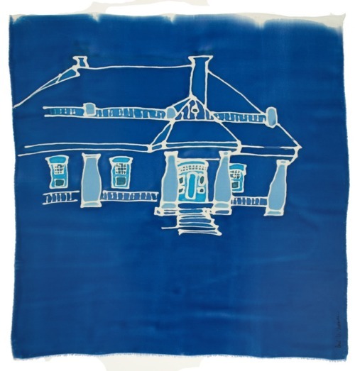
I had already been thinking a little about experimenting with screenprinting when my friend Lisa Fiscus approached me about developing a product for children. Lisa has created an amazing space in the Hawthorne House - it is equal parts fine decor boutique, interior design headquarters, and inspiration central! In addition to running her interior design services out of the building, she also offers a great selection of antique furniture, contemporary furnishings, and local art in the renovated showrooms. As the house was originally designed by Athens architect Fred Orr, we met when I was hard at work on the Orr2 exhibit that was held in the Circle Gallery in April 2009. For many of his buildings still standing in the Athens area, I created a silk piece highlighting a particularly interesting aspect of the design. In the case of the Hawthorne House, it was so amazing that I sketched the entire thing for my silk piece! Here it is:                        

Lisa recently decided to expand her offerings to include decor for children’s rooms. Though the shop carried some of my silk pieces, she asked if I might be interested in designing an animal alphabet. Her idea was to display a prototype in one of the vignettes that she would be setting up around the store in preparation for the big annual party. 

Since we wanted to develop a set of letters that could be used in any combination and in many different formats - on a pillow, as a wall hanging, even on pajamas! - we decided to choose a few to display on individual squares of fabric. After much discussion, we eventually chose a cotton muslin in a light cream color. 

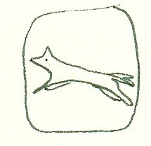
As for the pictures - well! The alphabet is so long, and there are so many animals to choose from! Studying dictionaries, encyclopedias, children’s books, talking to friends and family – I tried everything I could think of to come up with designs of animals that were unusual, recognizable, and aesthetically pleasing. Some letters were especially tough, like X and V and N, but my favorites were the elephant: 

 and the fox:


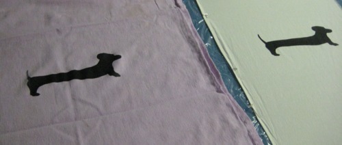
Finalizing my decisions and making the sketches was a lot of fun, but when it came time to print, I had a lot to learn! Though I silkscreened a couple of times in college classes, the details had to be worked out on my own this time. What kind of inks work best? What consistency is most effective? What’s the best way to blend colors? As each order would be unique, I wanted to offer customized colors, but I also wanted to be able to reliably reproduce colors. Watching someone create a silkscreened print, it looks so easy - but I worried about every step of the process!


It’s important to do a series of prints when silk-screening, as you never quite know which ‘pull’ is going to be the best. You don’t just make one, as I do with my silk paintings – and you have the opportunity to print on different cloths in the same series to see how the ink and design and fabric all work together. One thing I continue to be amazed at is that when silkscreening on a heavily textured cloth, the ink does not move down into the ridges and valleys of the cloth the way my silk dyes do – so the image left on the cloth is textured too, rather than being crisp and saturated. Smoother fabrics seem to take the print better – but I would love to figure out a way to achieve a crisp print on textured fabric! 

For the prototype that is still on display at the Hawthorne House, I decided to spell out the name of Lisa’s son. After much trial and error, and lots of repositioning, I completed the sample and hung it on the wall over a beautiful antique bed next to a giant lamp made from Hable Construction fabric. The vignette looks great! I’m so excited about this new direction that my work is taking, and I am pleased to have finally mastered this versatile skill. Though I’m still stuck on X and V and N, if you have any suggestions, let me know!!