BLOG

Keep up with the latest art and adventures from Rene Shoemaker Art!

Brooklyn + New York

 I grew up in New York, and as a 15-year-old I would go into The City (across the harbor on a ferry ride from Staten Island), and discover what my city had to offer. Bike riding on a Sunday morning in the financial district, watching the birds hover in Washington Square Park, sketching passengers on the subway and ferry, looking up at the tall buildings in Midtown, and saying out loud to myself: This is where I belong.

 As we know, my future lay in Georgia, not New York, and I am happy for that, but I am equally happy to be back visiting Brooklyn and Manhattan this week. I saw an old map when I was at the archives last week, spelling out the neighborhood my high school was in, not New Dorp, but Nieuwe Dorp, highlighting its Dutch ancestry. I was intrigued by this alternate spelling, and I love the sense of history the words gave to me.

 I went to the Brooklyn Museum of Art tonight and did sketches of Egyptian carvings. They were pretty inspirational – a few that I sketched for further reference are of an oryx, and a fish, from 1539-1292 BC!:


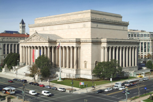
 The building is beautiful – they have added a modern entrance to their Beaux-Arts building, which gave a pretty wonderful feel of the new with the old. I loved the way that the piers of the old building were revealed to expose the red brick in the glass and steel lobby. The Brooklyn Museum website states that the :brick support piers that once housed the five front doors have been ‘excavated,’ restored, and left permanently exposed, showing the foundations of the institution both structurally and symbolically.” Very nice!


 As I type this, I am sitting in the Tea Lounge on Union Street in Park Slope. It is a most welcoming tea/coffee shop – with s p a c e something I have noticed is lacking in most restaurants and coffeeshops I’ve been to since arriving in the northeast. There is a nice buzz to the environment here – music, people talking, espresso machines swooshing – and I feel right at home. We are sharing a pot of Moroccan Mint tea while I work on this blog entry.


  I’ll be visiting some more museums and then heading back home to my studio in a few days. I can’t wait to see what artworks come out of my recent adventures!


On the Road

Hi everyone! I’m away from home this weekend, but I wanted to share a couple of interesting things that I’ve seen during my week in Washington, DC. I am here for a two-week course at the National Archives, which is housed in an amazing building right off the Mall.

I love it that I can dash over to the National Gallery of Art during my lunch break. I discovered an exhibit there called “From Impressionism to Modernism- the Chester Dale Collection,” and became enamored with one painting in particular: Henri Matisse’s 1917 painting Lorette with Turban, Yellow Jacket:

I keep returning to it to study The Master’s use of line and color in depicting Lorette. Matisse doesn’t seem to be too concerned about the exact correct naturalistic representation of her body… you can see that he is focusing on the emotion of color. One of the things that I love about Matisse’s paintings is the way that it feels like you can follow his pattern of thought – and his hand’s response – as he observes and paints his subject. Not only can you tell what he moved or removed as he painted her - the buttons of her jacket, for example, or the folds of her turban - but you can see the changes they make to the entire image, and guess at what he was trying to communicate. Those buttons become a triangle pointing directly towards her face, countering the movement created by all of those echoed lines in the turban. Those two strong features both bring attention to her intriguing face but, since they are balanced by each other, don’t overwhelm it. And the way that Matisse handled the background is amazing - look closely at the way both her chair and the background are different colors on each side of the painting, and the way the chair on the left is brighter and therefore balances out the dark wall on the right. Matisse once said that he does not attempt to paint a physical object, but “the emotion it produces upon [him].” I love the way he chose to communicate those emotions. 

(ps - if you’re interested, check out this scan of the 1917 New York Times article that that quotation comes from!) 

Yesterday I had a little more time, so I went up to Dupont Circle with a good friend of mine. We spent several hours checking out the Phillips Collection; where I discovered Gene Davis’s 1952 Black Flowers


I love the linear quality of the black stems, the abstractness of the image, and the way he indicates the flowers using the dots of stamens as well as a different directions of brush strokes, leaving the white petals as a suggestion, a hint for the viewer’s imagination. It took a minute for my eyes and my mind to take it in and sort it out - but when I realized what it was, it was like a great puzzle revealed itself to me.

The space of the Philips Collection is wonderful. I love the way they have reserved one whole room for Rothko paintings alone - it’s such a great feeling to step into a space and be surrounded by color, simultaneously comforting and invigorating. Color field paintings have always spoken to me… they re-affirm my need to create, to use color, to continue - forever - to explore that genre in my own work. Here is one of my favorites, the 1957 Orange and Red on Red:


I was here last Wednesday when the big snowstorm hit - that was quite an experience! Luckily, my class dismissed us early, and I was able to walk in the snow as it was just beginning to fall. Safely behind my hotel room’s large windows, I watched as the snow piled up and Washington slowly shut down. It certainly was beautiful - we never get that much snow in Georgia!

And this evening, as I was picking up a few things for dinner at Whole Foods, the electricity went off! As I walked back to my hotel I saw that several blocks had been affected by the power outage, including the one with my hotel on it. Everyone spilled into the streets, creating a festive atmosphere - it almost felt like a block party or street parade! Once again I sat in front of that large window and watched the world react to this latest surprise. Windows really are the eye to the world - or is it supposed to be that the eyes are the window to the soul?

Next week I’ll be posting from New York City! Feel free to email any art/coffee suggestions to check out while I’m there!

Rene, all of your ideas sound so exciting! I think you should do more with your sketches… either on paper or on fabrics… and I love the idea of silkscreened prints! As for colors I think the vivid ones are most striking with your designs… but I do like it when you use variations on the same light color, like that second example!

Moving Forward

 I’ve been thinking a lot lately about ways to involve others in my artwork more. Part of this is making my work more accessible, through an expanded product line, but I’m also interested in hearing more about what aspects of my work you respond to most and which you think could use some work. So this week, I’d like to turn this space over to you and your thoughts. I hope that this collaboration will be inspiring for everyone!

 First I’d like to apologize for the difficulty in submitting comments up to this point. I should explain that tumblr provides a designated page for this purpose, rather than using the more common method of commenting on individual blog posts. At any time, you can click on the words “Tell me!” at the top of the blog page to send a message to me. After I approve the message (just to keep out spambots!) it will be posted on here for all readers to see.  You can also click on the words “Ask me!” to submit a question. When I answer it, your question and my answer will be posted together so that everyone can read it.


I’ll have table linens and tea towels available soon, but I’m considering tote bags or t-shirts too. I’ve also been looking into producing prints – both new screenprinted designs and giclee print reproductions of painted silk pieces. If you can think of any of my designs you’d especially love to see on a product other than silk scarves, I’d love to hear about it!

I’m also interested in how others respond to my color choices. While I used to tend towards lighter, more subtle colors, I’ve been experimenting the past few years with more bold, vivid colors. (for examples of lighter colors, click here  or here, and to see the bolder palettes, click here  or here.) 

And from all of you in similar fields – if you’d like to comment on what decisions go into introducing a new product, please share!

And one final question – is there any particular technique that you are interested in learning more about? I’d love to introduce a regular feature on here where I explain, try out, or research a technique or medium… sharing the results with you, of course!

 Now tell me your ideas! Go!