BLOG

Keep up with the latest art and adventures from Rene Shoemaker Art!

New art installation for UGA

Last week my new (huge!) UGA art installation went up. Meet Passages II!

The artist’s statement for this site-specific design includes information about the mobile and its concept:

The mobile was installed in honor of Dr. Jane Russell, the woman who envisioned and created the Ramsey Student Center for Physical Activities, the place we can visit to discover our personal best. We celebrate Dr. Russell’s service to the University upon her retirement, and wish her well in all her endeavors.

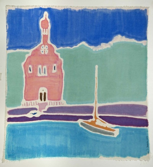
The charmeuse silk squares, and the square designs placed on the silks, represent movement through time and space, the journey we take in life to find our way. This art installation was conceived and created by fiber artist René D. Shoemaker.”

I love creating site-specific work. As I studied this location (at the Ramsey Student Center for Physical Activities on the University of Georgia campus), I thought very carefully about how my design would affect and be affected by its setting. As you may have read before, I love squares, so I was pleased that my work would be situated in front of a wall of square windows. The windows correspond so nicely with the colorful silk squares in my installation! As my intention was to create a feeling of movement - ascending -  through the color choice and movement of the individual pieces, the fact that it is installed next to a climbing wall also seems very appropriate. I love the idea of the climbers looking back over their shoulders and seeing this colorful mass moving behind them! 

It took two days to complete the installation. I needed to do the layout, and the measuring and cutting of the monofilament to hang the silk, on site. I set up a system of measuring without tangling the line and even used my toes as pliers when I didn’t have a second pair available! I sewed and tied and stretched and prepared each of the silks for hanging:

The installation process was a work of art in itself. I had a whole hallway to work in, and I laid the silk on the floor in the configuration in which it was going to hang. The space has 47’ high ceilings, so a Genie Boom-Lift bucket was used to hang the work from the ceiling. The boom-lift had amazing articulation, and could go anywhere it needed to - sideways,forwards, backwards, up or down. The silks were tied to 3 armatures, and each armature needed to be hung on to the ceiling separately. They were clipped onto a hook and bearing that had already been installed. 

…It was a fabulous experience, seeing the silks being lifted to the sky (or ceiling, as the case may be), and then watching how they reacted to the air currents. This may not be evident from the photos, but not only does each silk slowly spin at its own pace, but each of the three different armatures revolve independently as well! It is so pretty. The silks look out over the courtyard beyond the windows:


It was very rewarding for me, to stand there, and to watch the colors come alive as if they were dancing. I didn’t expect this, but the stretched silk softly ripples on each of the  units when the air currents change, making an even more lively display.

Many thanks to the “team” who helped make this happen, especially to Benny at the Instrument Shop for creating the metal armatures, rods, and bearings for the silks to spin on, and to Jeremy for being a professional at using the bucket lift for the installation, and for understanding the concept of the design. Thanks to Keith for seeing the project happen, and of course - many thanks to Jane Russell for the inspiration!

Here are some members of the team at the time of completion - don’t we all look happy to have it done?

All-in-all it was an amazing experience and I hope to do many more such commissions in the future! 

Coffee! - 9th Street Espresso, NYC


My favorite coffee shop in all of New York City is 9th Street Espresso - and although I love the three newer locations too, I’m talking about the original, down to earth, fun-to-be-in, coffeeshop-vibe-experience storefront at 9th Street Espresso, 700 East 9th Street between Ave C & Ave D, NYC. I love returning to the Village, I love the neighborhood, I love the street scene, and I love the community garden across the street from 9th Street Espresso…

I was so moved by my experience at 9th Street Espresso that I sketched a drawing on site, then came home and made a silk painting from it (see above). This painting was in my solo exhibit at the Shade Bar at 241 Sullivan Street (between Bleecker St and 3rd St).

You can be sure that the day of my exhibit, after eating a yummy grilled eggplant sandwich at the Shade, I walked to the East Village and had a shot of 9th Street Espresso to keep me going deep into the night!

I highly encourage anyone who values a great coffee experience to stop by 9th Street Espresso. Their no-nonsense approach to creating a great cup of espresso is very satisfying! 

Colors!

I went to a lecture recently at the Georgia Museum of Art to learn more about one of my favorite topics - color!  The UGA Fabric Design Department invited Leslie Harrington, the Executive Director of the Color Association of the United State (CAUS), to visit in celebration of an exhibit that is currently on view at the Georgia Museum: “Pattern and Palette in Print: Gentry Magazine and a New Generation of Trendsetters”.

Heading up an organization that was founded in 1915, Ms Harrington and her company “creates and delivers global color intelligence across industries”. That means they analyze popular colors over time, they predict which colors will become popular next, and they educate others about the importance of coordinating colors across industries. So, they help to ensure that all American flags are the same colors, that your neighbor’s camouflage shorts will use the same hues as his camouflage coffee mug, and that your cousin will be able to buy kitchen appliances, an apron, AND nail polish in fun retro colors. Rather than working directly with consumers, they position themselves as “trusted advisor(s) to color professionals whose responsibility is to ensure marketplace success for their color decisions in the realm of brands, product and service, and spatial environments.” Even Pantone looks to them for advice and ideas! How cool is that??

An example of what you might see:

As for the GMOA exhibition, it introduced me to Gentry magazine, which, it turns out, is one cool magazine. Gentry was published from 1951 to 1957 and its mission was to help a gentleman be, well, just that - a gentleman. It covered many topics - art, future, fashion, literature. It was extremely well put-together; heavy paper, original art and actual fabric swatches to help people really know about the colors and patterns of the items that were being advertised in the magazine!

It had many famous contributors. Even my favorite artist, Henri Matisse, had artwork on the cover of the journal in 1956-57. The GMOA writes about about the cover here.

The students of the UGA Fabric Design department (my alma mater) created their own color palettes and designs in response to articles and advertisements in Gentry magazine. The resulting textile designs were silkscreened on large swaths of paper and are on display in the Georgia Museum’s exhibition. Here are three examples of what the students created:

Nice, yes?

Back to color, though -  imagine living in a world immersed in color, like Ms. Harrington does.

Oh - you say, that is what I do? 

        You are right! I am very lucky!

Ms. Harrington gave me a few tidbits that I jotted down to think about for my own work:

Color preferences of consumers for a specific period and time.

    As an artist, I have shied away from the concept of being sensitive to other’s color preferences. But as a creator of items for interiors and fashion, I guess I should pay attention! I was aware of color forecasting, but this lecture opened my eyes to the benefit of keeping up with it, and the myriad of possibilities involved in working with or anticipating trends. I had never thought about how strongly people associate certain shades with certain emotions, events, objects, or even time periods. Do you remember the deep oranges and browns that many people associate with the 70s? Isn’t that what you immediately think of when you see, say, a dark orange couch? 

Colors come in three flavors: Fad vs trend vs classic

   Now I have a way to categorize colors as I discover them. A fad may be bright color that seems to be everywhere for a brief period of time. Neons often seem to fall into this category! A trend is a little more classy, and lasts a little longer. Shades like jewel tones are versatile and pleasing to the eye. A classic, well, it makes you feel good; it is a staple, an elegant choice; yet it can be luxurious or casual. Classics like Black, Ivory, White and Brown are always popular!

Color across industries, across markets, across specializations, across disciplines, and across experiences…. 

     Color is everywhere! Watching what color is doing in these various categories will only help me become stronger in my art of color. My mind has now been opened to the bigger world of color. It will be fun to begin exploring these categories, to keep up with what is happening in color, and to see what is influencing the world of color, fashions and interiors.

If you are interested in looking at more information about all this, there is a list of articles related to color and/or color forecasting on the CAUS website:

http://www.colorassociation.com/media

Learn more about CAUS and the ways that they empower color conscious decisions at:

http://www.colorassociation.com/

Now, you will never look at color the same way again!

                What are your favorite experiences with color?


Accepted into a Juried exhibit!

Two silk paintings of mine have been chosen to be in the OCAF 17th Juried Exhibition this year! You may recognize this design of Port Vendres - I’ve done two versions of this location.

This one is on silk broadcloth which is about the weight of painter’s canvas. The silk broadcloth gets smooth and soft with washing, and the dyes lay down on the silk like some watercolors do on heavy paper - you can see the brush strokes, and the way the dye is taken up by the silk quite nicely. The painterly effect here is much different than what happens when dyeing lighter silks.

The church was a wonderful discovery in a French town, Port Vendres, on the Mediterranean coast near the border with Spain. Notre Dame de Bonne Nouvelle -”Our Lady of Good News” is a fitting name for a late 19th century church whose town is a fishing and cargo port. I can imagine the women of the village awaiting the return of their loved ones from the sea and being so glad of their safe return that they prayed to  Notre Dame de Bonne Nouvelle. The church faces the harbor, and I loved the idea of this amazing building inviting people to come in - whether it be by foot, by bike, by auto, or by boat.

Teal City, the second piece that was juried in, is a fanciful place where color rules over order. I see this city bordering, again, on the waterfront, as Manhattan, NY or Sydney, Australia does. The colors are absolutely fantastic together, the material is the same heavy silk broadcloth. While Port Vendres is on the large size, at 29”x 26”, Teal City is smaller and intimate, at 4” x 9”. Both pieces are framed in a beautiful blonde wood frame, and with Teal City, the placement of the silk painting on the mat board within the frame is what inspired me to call it a ‘city’. It floats a little higher than the horizon line, giving me the impression that it is bordering on a body of water. It is an abstract design, totally about the relationship of the colors and shapes, but isn’t it true that all abstract art, when seen, is “read” by the viewer into their own understanding of what it is?

What do you see in “Teal City?”

Come by the OCAF gallery anytime to see the exhibit. The gallery is open 10-4 Tuesday-Saturday. The reception is this Friday night, April 6th, from 6-8 pm! I would love to see you there, and the collection of work displayed by all the artists will be very strong, I am sure. OCAF consistently attracts a great variety of local and national artists.

What a fun evening event it would be to go to with a friend!

Southworks: 17th Annual National Juried Art Exhibition April 6 through May 11, 2012                   Oconee Cutlural Arts Foundation            Reception: April 6, 6-8 pm                        Watkinsville, Ga Free & open to the public                          706.769.4565